Rosa Träume Social Media
Year
Still Active
Workspace
Client
Type of Tools
Illustrator
Figma

Briefing
Rosa Träume is a yarn shop for which I had previously redesigned the website. However, following the website’s relaunch, the existing social media presence no longer matched the new brand identity. As a result, I was commissioned to develop a consistent design language for social media and then create matching posts and Reels.
The New Website
1/6
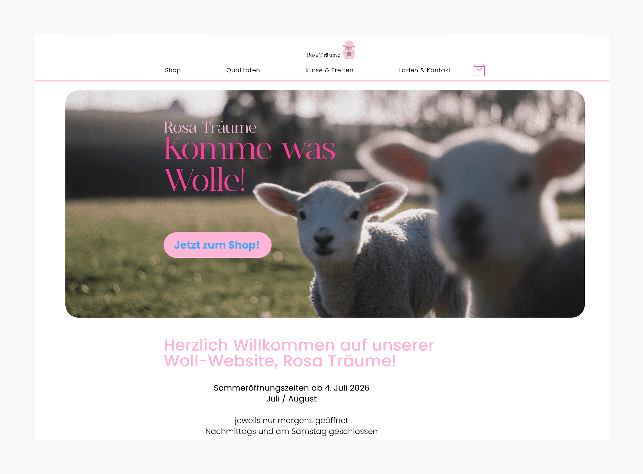
The Rosa Träume website.
Here you can see the homepage of the new website. The design features light shades of pink, plenty of white space, and a calm layout. I wanted to reflect this same atmosphere on social media channels as well, to create a consistent brand image.
Logo from Rosa Träume
2/6

The new Rosa Träume logo.
This is the Rosa Träume logo. I immediately realized that the sheep would be perfect as a recurring design element for social media. Since I had designed the logo myself, I was able to use the existing files to create additional sheep illustrations.
Instagram Inspirations
3/6

Three sources of inspiration for a new design.
To start, I researched various sources of inspiration and analyzed relevant social media accounts. I was particularly drawn to designs that create a harmonious overall effect using simple design elements. I wanted to achieve exactly this calm, feminine vibe, as it’s a perfect fit for the target audience.
Various Design Options
4/6

Step-by-step guide to a new design.
I then experimented with different design variations. I tested various colors, knitted elements, and layouts. However, it quickly became clear that some of the designs didn't harmonize with the website's new look.
New Design
5/6

First post with the new design.
In the end, I decided to use the same color palette as on the website. This created a consistent brand identity, where the website and social media visually complement each other perfectly and ensure high brand recognition.
New Sheep Illustrations
6/6

New post with the sheep mascot.
A key element of the concept was the sheep as a recurring mascot. Whenever contextually appropriate, it appears in the posts, often at the beginning or end of a post or Reel. This creates a likable sense of familiarity and gives the brand mo
This project gave me a lot of creative freedom. Through it, I learned how important it is to try out different ideas and to constantly question my designs. Often, the best solution only emerges after several attempts. I also realized the added value a mascot can bring to a brand. Especially on social media, it helps build brand recognition, gives the brand personality, and creates a consistent visual identity.